How surveys appear at the checkout (multi-step vs single-step layout)
Switch between the multi-step or a single-step layout for the checkouts

Optimizing the checkout funnel is of utmost importance for conversions. You wouldn't want the checkouts to take too long as it might result in the high bounce rate and having your customers disengaged. At the same time, omitting important steps at the checkout may result in failure of collecting important data from your customers. In this article, we're talking about different options of layout for the surveys on your product checkouts.
Multi or single-step layout
Speaking of conversion rate, checkout funnel shouldn't be too short or too long for the customer. There is a sweet spot between the two that will match just perfect UX for your product checkouts and will enable you to collect all necessary information from the customer at the same time (without being tedious or tiresome with the amount of questions).
When creating a survey, you can choose between 2 different layouts for the survey to be presented on the actual checkout. Toggle you can use to set whether you'd want it to be presented as a multi-step or as a single-step survey can be found on the main survey creation page and it's presented in the picture below.
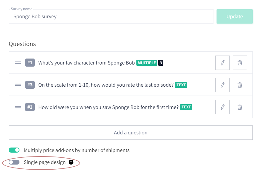
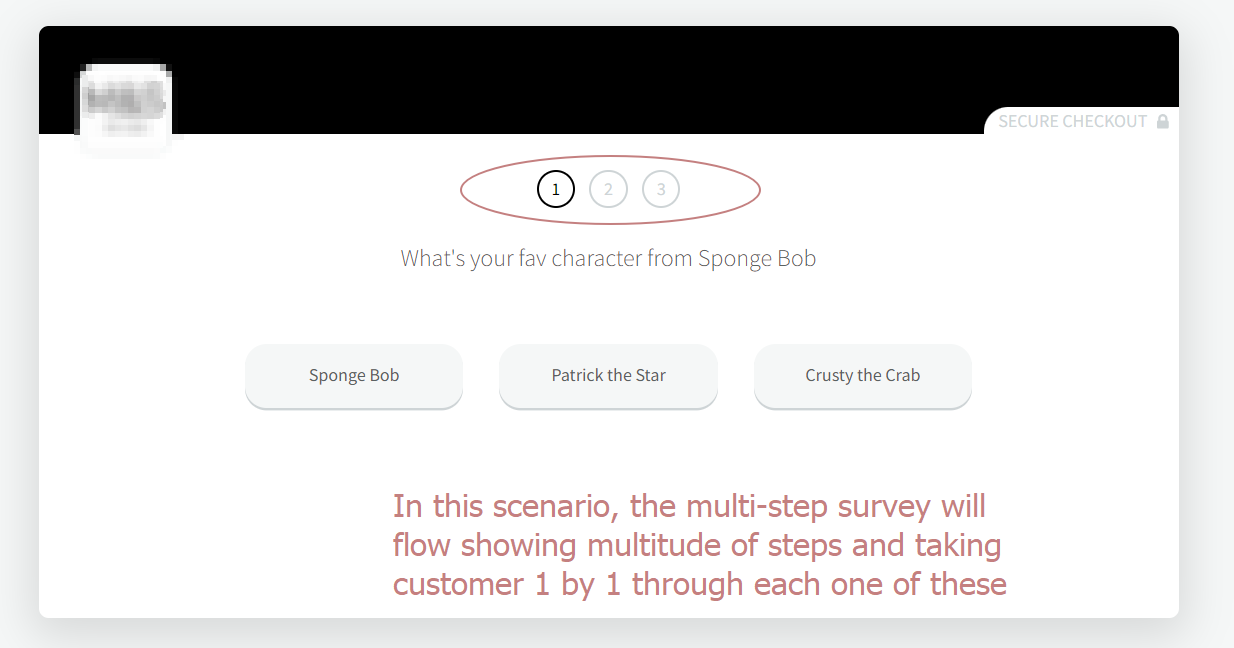
Logically, if this toggle is inactive (which is a default state) the survey will flow as a multi-step, and it will appear like this on the checkouts.
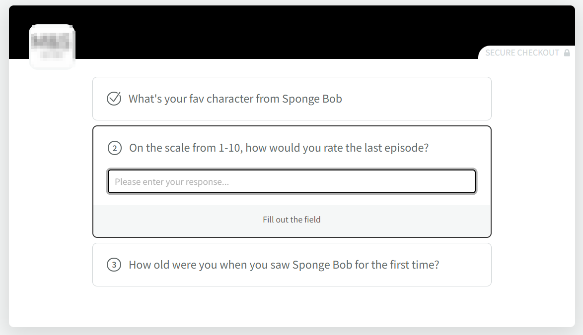
However, if you prefer the single-step design more, you need to toggle the active state, in which case the checkout will look like the one below.
How did we do?