Account & Billing
Can I switch between pricing plans? (on Subbly)
Setting up Stripe
Setting up PayPal
Setting up Braintree (or PayPal through Braintree)
Setting up Auth.net
Setting up Apple Pay & Google Pay?
Setting up a specific billing time
How to connect a domain to your website?
Handling invoices
How do I set the currency for my store?
Country of trade setting
Timezone setup
Taxes
How do I export taxes on Subbly?
Can I grant access to more users to my account? (Teams app)
Can I manage the email notifications I receive?
How do I put my Subbly store and website offline?
How do I cancel my trial?
How do I cancel my account?
Preventing Customer's Cancellations
Checkout & Payments
Setting up the checkouts and customer portal on custom domain
Testing checkouts and customer portal
Setting up your branding
How do I remove Subbly branding from the checkout?
How to translate the checkout and the customer portal?
How do I add Terms & Conditions to the checkout?
Do my customers need to register to make a purchase?
Checkout & cart widget behavior
Setting up cart widget
How to enable 3DS confirmation step at checkout?
Setting up multicurrency
How to change the position of the currency symbol at the checkout?
Why are my checkouts not working?
Updating cart widget based on webpage actions
Altering cart widget functions by embedding Subbly Javascript
Website Builder
Dashboard apps
Articles App
Logo maker app
Designer Tools: Overview
Fonts App
Pages App
Designer Tools: Layout
Designer Tools: Typography
SEO App
Domain App
Languages App
Designer Tools: UI Kit
Templates App
Media App
Pop-Ups App
Getting started with Dashboard and Apps
Site Settings App
Elements
Icons element
Blank space element
Language Switcher Element
Image Slider element
Form element
Map element
Product/Products Element
Breadcrumb element
Account Element
Accordion element
Button/Product Button element
Sharing Buttons element
Logo element
Quotes element
Paragraph element
Custom HTML element
Search element
Region Switcher element
Divider element
Articles and Article Categories element
Follow Us element
Gallery element
Title element
Video element
Image element
Countdown element
Pages element
Edit mode
Troubleshooting ''there is an update'' error
How to change the title for your website?
How to add a cookie consent banner to your Subbly site?
How to create a banner on the website builder?
How to submit your website to Google, Yandex, Bing or Yahoo?
How to embed Instagram feed to my website?
How to create anchor points on your website?
How to set up event tracking codes on your website?
Adding chatbot to your Subbly site
Adding visual effects to your website
Building a page from scratch with Subbly
How to add images and videos to your website?
How to add GIFs to your website?
Configuring SSL for your website
Desktop vs. Mobile versions of a website
Positioning of elements
Why my domain was labeled as HREFLANG?
How to add Trust Pilot reviews to your website?
How to build your own product layout?
Setting up Headers and Footers across pages
Managing visibility settings of Elements and Blocks
How to create a Blog?
How do customers leave a review for my products?
Getting Started with the Website Builder
Basics of the Edit Mode
How to publish the latest changes on your website?
Previewing your Subbly website
Adding and creating Blocks on your website
How to localize your website (create a multilingual website)?
Colors tool
Why do the products go to 404 page?
How to create product category filter (Website builder)
AI Website Builder
Products
Product builder wizard
What are subscriptions?
Ad-hoc subscriptions
Anchored subscriptions
Understanding cut-off dates
Incoherent subscriptions
Implications of using Anchored + Incoherent
Setting subscriptions to auto-expire
Membership subscriptions
Content feed (How to use Subbly as a paywall?)
How to set sequential subscriptions in Subbly?
Seasonal subscriptions
How does the pre-order setting work?
How to set up pre-paid subscriptions?
Setting up commitment period for your products
Setting up trial period for subscription products
How to set up shipping methods for my store?
Setting up Mondial Relay
How gifting works?
How to use gift vouchers?
How to create one-time products?
Using one time products as bundles
How do I edit my product price and billing settings?
Can I set my subscriptions to auto-cancel themselves?
How to create "Subscribe & Save" offers on Subbly?
How to unpublish a product?
Setting up funnels
Subscription add-ons
Fixed bundles
Customizable bundles
Subscribe and Save bundles
Setting up subscription products
Survey builder
Customers
How customers manage their subscription? (Customer portal)
Can I add customer's subscriptions manually?
Customer's Labels Explanation
How to switch the subscription product customer is subscribed to?
How to change renewal date for a customer?
How can I see my customers' preferences?
How to change the shipping address for a customer?
How customers change their password?
Can customers add products to their subscription?
How to process a refund for the customer?
How to reactivate customer's subscription
How does skipping/pausing work?
Handling customer email notifications through Subbly (Templated emails)
Account credit balance
How do I export my customer data from Subbly?
Why my customer wasn't charged?
How to cancel customer's subscription?
Event Logs
AI Author Bot (powered by AI)
Orders
Order Labels Explained
Handling Orders
How to filter orders?
Importing Orders
Can I create a test order?
How to create adhoc orders/charges?
How to add a tracking number for customer's order?
Why am I not seeing my orders?
Why my orders don't appear in my Shipstation admin?
Growth & Retention
Customer retention
How dunning tool works on Subbly?
Cancellation Offers (Cancellation Flow)
Cancellation Analytics
Churn Insights
Payment Failure Email
Upcoming Renewal Email
Predictive churn (powered by AI)
Growth tools
Automations FAQ
Automations recipes (use cases)
Coupons
Inventory Management
Handling out of stock
Using cart abandonment tool
Setting up lead forms and converting leads
Setting up the referral tool on Subbly
How to setup affiliate tracking through Subbly?
Adding conversion tracking to the checkouts
Analytics FAQ
Setting up Addons Upsell
AI Addon Bundle
Integrations & App Store
App store
Setting up Chartmogul
How to use other shipping services with Subbly?
Setting up Facebook CAPI & Pixel
Setting up Google Tag Manager
Setting up Google Analytics
Setting up ManyChat integration
Setting up Taxjar
Setting up Facebook Login
Setting up Google Auth
Setting up Mailchimp integration
Setting up Drip
Setting up HotJar integration
Setting up Flodesk (through Zapier)
Setting up Zendesk integration
Setting up Pirate Ship integration
Setting up Shipstation integration
How does the ShipStation integration work?
Setting up Bablic
Setting up Zapier
Setting up Klaviyo
Setting up Twilio integration
Setting up Intercom integration
Setting up SendGrid
Setting up Postmark
Setting up CartStack
How to edit checkout layout through Google Optimize?
Embed Subbly into external platform(s)
FAQs
FAQ about Subbly
What countries is Subbly available in?
How do I get help? (How to contact support)
What payment gateways are supported on Subbly?
Stripe vs. Paypal: Which one to use?
How much traffic can the Subbly servers handle?
Pricing plans, pricing structure and applicable transaction fees on Subbly
How and when do we charge VAT?
Does Subbly offer refunds?
Can I use Subbly for POS sales?
How can I migrate my customers from Stripe?
How can I migrate my customers from PayPal?
Does Subbly integrate with any accounting platform?
How to transfer domain between sites on Subbly?
Why doesn't Subbly have a marketplace?
Why my checkout redirects to a different product?
What shipping integrations do you provide?
When do I get paid?
Global metadata (Attributes and Tags)
How can I access my previous receipts/invoices?
How can I send emails to my customers?
Working with Subbly Experts
Migrating to Subbly
Getting started with Subbly Guide
- Subbly Help Center
- Website Builder
- Elements
- Button/Product Button element
Button/Product Button element
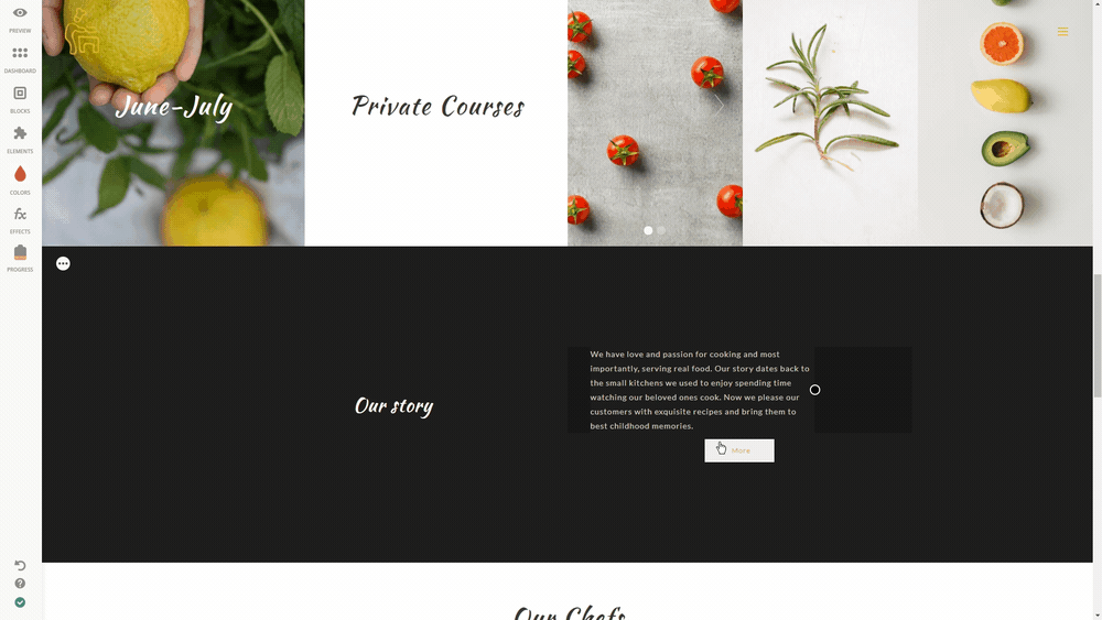
If you're that picky crafter who wants every single element on your site look exactly the way you prefer and now wondering how to edit the Buttons to match your taste, you'll apparently find this article helpful!
Which buttons are available?
Please pay close attention that you're able to use 2 different types of button elements on Subbly:
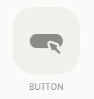
- Regular button element which enables you to add a button which you can make redirect to any internal or external link. Remember that you can create inner pages on your Subbly site by adding pages as explained here. You can subsequently use these pages to redirect from the button.
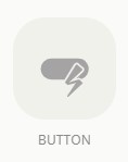
- Another type of button is a so-called Subbly product button (you can easily recognize this one as it has Subbly zap logo over it). This one can only be used to initiate the checkout of a product or to simply act as an Add to Cart button for a product. This one is not to be used to redirect to any other type of page (internal or external).
Technicalities of both of these buttons are practically the same and can be found in the section below.
Settings
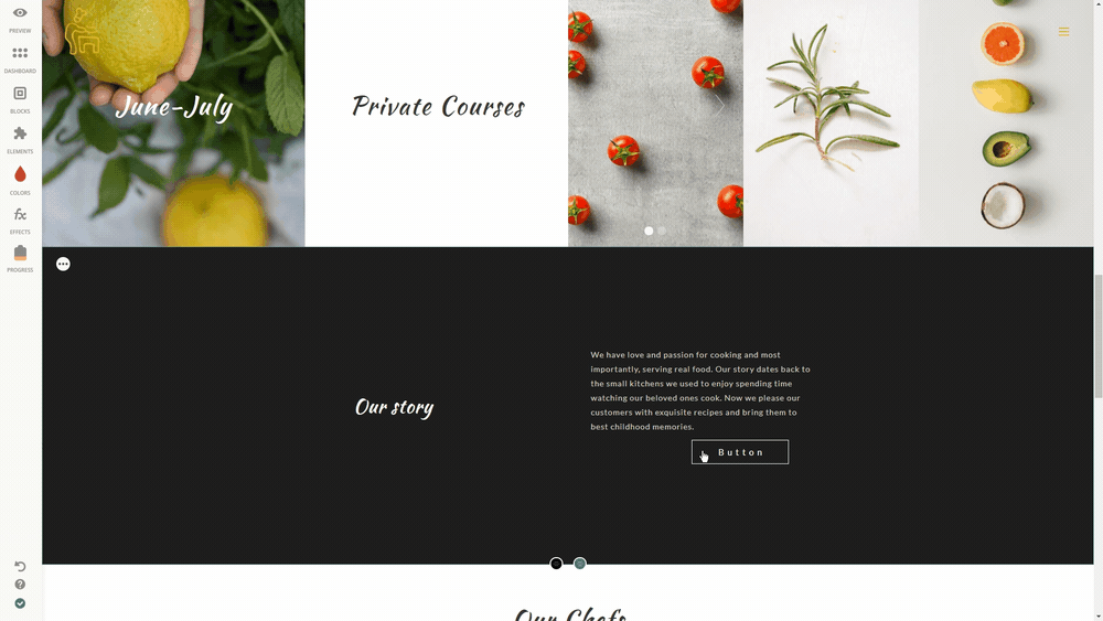
Edit Icon - Start editing the Button Element by simply clicking on it and choosing the desired option from the Settings. You'll notice a new window appear with a list of button settings ready to be changed.
Style - Change the font of your button's text, click on the Fonts and play around with the pointers to change the font size, weight or letter spacing, you can also customize the button borders and size including Height, Width and Padding using the pointers.
Pay attention to the lock, if it's closed, then all corners will be changed in the same way. As long as the lock is open, you can change every button corner and side separately!
Color - Change the Color of the button and its text by just clicking on Colors and choosing the shade you need. You can change the color of the Background, Border and Text as well, choose a necessary field and move the pointers.
Type a text for your Button, then pick the desired button from the ones you've created from Edit Button section.
Link - Click on the edit Link icon and decide where you want your visitors to be redirected to an Internal, External or an Anchor page, add the link or select an inner page, enable the switcher below if you want the page to open in a New Tab.
Alignment - To change the alignment settings of the Button, click on the Alignment icon you’ll have three options available: top, center or bottom, so just choose the one you prefer.
Visibility Settings - This setting enables making a certain Element/Block appear on Desktop, Mobile only, or everywhere by default. Simply hit Visibility Settings and choose the desired option from the drop down menu to get full control over the visibility of the elements on your page.
Next comes Location visibility. Include or exclude specific cities or countries or set the appropriate Custom IP.
Trash Icon - If you don't need the Element anymore, Click on the Trash icon to remove it from your page.
You can also check out the UI Kit section for more insight on how to create powerful CTAs.