Account & Billing
Can I switch between pricing plans? (on Subbly)
Setting up Stripe
Setting up PayPal
Setting up Braintree (or PayPal through Braintree)
Setting up Auth.net
Setting up Apple Pay & Google Pay?
Setting up a specific billing time
How to connect a domain to your website?
Handling invoices
How do I set the currency for my store?
Country of trade setting
Timezone setup
Taxes
How do I export taxes on Subbly?
Can I grant access to more users to my account? (Teams app)
Can I manage the email notifications I receive?
How do I put my Subbly store and website offline?
How do I cancel my trial?
How do I cancel my account?
Preventing Customer's Cancellations
Checkout & Payments
Setting up the checkouts and customer portal on custom domain
Testing checkouts and customer portal
Setting up your branding
How do I remove Subbly branding from the checkout?
How to translate the checkout and the customer portal?
How do I add Terms & Conditions to the checkout?
Do my customers need to register to make a purchase?
Checkout & cart widget behavior
Setting up cart widget
How to enable 3DS confirmation step at checkout?
Setting up multicurrency
How to change the position of the currency symbol at the checkout?
Why are my checkouts not working?
Updating cart widget based on webpage actions
Altering cart widget functions by embedding Subbly Javascript
Agentic Builder
Getting Started
Welcome to Subbly's agentic builder!
Pricing, Costs, and Credits Explained
A Quick Tour of the Agentic Builder Interface
Prompting for Success: How to Talk to the Agent
How to Create Your First Prompt
Your First Project: A Step-by-Step Guide
My Agent isn't Behaving as Expected: Common Issues and Fixes
Optimizing for Performance and Credit Usage
Contacting Support
Cancelling Your AI Website Builder
Core Features
How to Revert to a Previous Version
When to Start a New Chat
Setting up Your Project Settings
How to Write Effective Project Instructions
Understanding the Different AI Models Available
Understanding the Element Selector Tool
Deploying Site
Changing the mobile layout vs. desktop layout
How-to Guides
Connecting Products to the Site
Connect product checkouts to elements
Build product page with pricing plan selection
How to add upsell to the checkout funnel
Create a survey flow with an add-on
Creating a bundle page
Build one-time shop with filtering and sorting facilities
Create a newsletter form with backend capture
Integrating map and store locator
Optimizing site's SEO
Create a blog
Free Resources
Products
Product builder wizard
What are subscriptions?
Ad-hoc subscriptions
Anchored subscriptions
Understanding cut-off dates
Incoherent subscriptions
Implications of using Anchored + Incoherent
Setting subscriptions to auto-expire
Membership subscriptions
Content feed (How to use Subbly as a paywall?)
How to set sequential subscriptions in Subbly?
Seasonal subscriptions
How does the pre-order setting work?
How to set up pre-paid subscriptions?
Setting up commitment period for your products
Setting up trial period for subscription products
How to set up shipping methods for my store?
Setting up Mondial Relay
How gifting works?
How to use gift vouchers?
How to create one-time products?
Using one time products as bundles
How do I edit my product price and billing settings?
Can I set my subscriptions to auto-cancel themselves?
How to create "Subscribe & Save" offers on Subbly?
How to unpublish a product?
Setting up funnels
Subscription add-ons
Fixed bundles
Customizable bundles
Subscribe and Save bundles
Setting up subscription products
Survey builder
Customers
How customers manage their subscription? (Customer portal)
Can I add customer's subscriptions manually?
Customer's Labels Explanation
How to switch the subscription product customer is subscribed to?
How to change renewal date for a customer?
How can I see my customers' preferences?
How to change the shipping address for a customer?
How customers change their password?
Can customers add products to their subscription?
How to process a refund for the customer?
How to reactivate customer's subscription
How does skipping/pausing work?
Handling customer email notifications through Subbly (Templated emails)
Account credit balance
How do I export my customer data from Subbly?
Why my customer wasn't charged?
How to cancel customer's subscription?
Event Logs
AI Author Bot (powered by AI)
Orders
Order Labels Explained
Handling Orders
How to filter orders?
Importing Orders
Can I create a test order?
How to create adhoc orders/charges?
How to add a tracking number for customer's order?
Why am I not seeing my orders?
Why my orders don't appear in my Shipstation admin?
Growth & Retention
Customer retention
How dunning tool works on Subbly?
Cancellation Offers (Cancellation Flow)
Cancellation Analytics
Churn Insights
Payment Failure Email
Upcoming Renewal Email
Predictive churn (powered by AI)
Growth tools
Automations FAQ
Automations recipes (use cases)
Coupons
Inventory Management
Handling out of stock
Using cart abandonment tool
Setting up lead forms and converting leads
Setting up the referral tool on Subbly
How to setup affiliate tracking through Subbly?
Adding conversion tracking to the checkouts
Analytics FAQ
Setting up Addons Upsell
AI Addon Bundle
Integrations & App Store
App store
Setting up Chartmogul
How to use other shipping services with Subbly?
Setting up Facebook CAPI & Pixel
Setting up Google Tag Manager
Setting up Google Analytics
Setting up ManyChat integration
Setting up Taxjar
Setting up Facebook Login
Setting up Google Auth
Setting up Mailchimp integration
Setting up Drip
Setting up HotJar integration
Setting up Flodesk (through Zapier)
Setting up Zendesk integration
Setting up Pirate Ship integration
Setting up Shipstation integration
How does the ShipStation integration work?
Setting up Bablic
Setting up Zapier
Setting up Klaviyo
Setting up Twilio integration
Setting up Intercom integration
Setting up SendGrid
Setting up Postmark
Setting up CartStack
How to edit checkout layout through Google Optimize?
Embed Subbly into external platform(s)
FAQs
FAQ about Subbly
What countries is Subbly available in?
How do I get help? (How to contact support)
What payment gateways are supported on Subbly?
Stripe vs. Paypal: Which one to use?
How much traffic can the Subbly servers handle?
Pricing plans, pricing structure and applicable transaction fees on Subbly
How and when do we charge VAT?
Does Subbly offer refunds?
Can I use Subbly for POS sales?
How can I migrate my customers from Stripe?
How can I migrate my customers from PayPal?
Does Subbly integrate with any accounting platform?
How to transfer domain between sites on Subbly?
Why doesn't Subbly have a marketplace?
Why my checkout redirects to a different product?
What shipping integrations do you provide?
When do I get paid?
Metafields and Tags
How can I access my previous receipts/invoices?
How can I send emails to my customers?
Working with Subbly Experts
Migrating to Subbly
- Subbly Help Center
- Agentic Builder
- Getting Started
- How to Create Your First Prompt
How to Create Your First Prompt

This article will guide you through the process of developing an excellent initial prompt and then dissecting it for all of the component parts that make it so great.
Important considerations
- Be clear about your site structure before starting the build. Have a defined vision of what you want to create, including the key components, number of pages, layout style, and the full checkout flow. Knowing this upfront helps ensure consistency and efficiency throughout the project.
- Start with smaller, focused prompts instead of asking for a full website in one step. Large one-shot builds often produce incomplete or inconsistent results. If the homepage is simple, you can prompt for it as a whole, but it is usually best to begin with a single section such as the hero area and build from there.
- When words are not enough to explain what you need, use screenshots for visual guidance. Upload an image that represents the layout or look you are aiming for so the builder can use it as inspiration.
Example prompts
Let's give a couple of examples on how the first prompt should look like based on the different use cases.
Creating a landing page similar to FabFitFun.
Create a high-converting landing page modeled on FabFitFun’s “Get the Box” page. The design should feel modern, premium, and lifestyle-oriented, with a soft and feminine visual language. Use a clean white background (#FFFFFF) with light beige (#F8F6F4) section dividers and muted gold (#B89B83) accents for icons and CTAs. Apply thin light gray borders (#E6E6E6) to cards and content blocks. Buttons use rounded corners (8px radius), soft shadows, and hover state in #B89B83 with white text. Layout should follow a centered 12-column grid with generous spacing (80–100px) between sections.
At the top, include a full-width hero section with a bright lifestyle image background and overlay text: “Discover Your New Favorite Things” followed by a short subtext “Curated seasonal boxes filled with beauty, wellness, and home essentials delivered to your door.” Place a bold CTA button “Get Started” linking to plan selection.
Below the hero, create a “How It Works” section with three evenly spaced steps in a horizontal row, each using an icon, short headline, and description. Example: “1. Personalize your box – Choose products that match your style,” “2. Enjoy flexibility – Swap, skip, or update anytime,” “3. Save more – Get premium brands for less.” Use soft card borders and equal spacing.
Next, add a “What’s Inside” showcase with a clean 3-column grid of lifestyle product categories (Beauty, Home, Wellness, Fashion). Each card includes an image, short name, and small descriptive text. Keep visuals bright, airy, and evenly framed.
Follow this with a testimonial and trust section in beige background (#F8F6F4). Headline: “Trusted by Over a Million Members.” Underneath, list three horizontally aligned benefit icons with short blurbs such as “Save up to 70% off retail,” “Exclusive member sales,” and “Customize every box.”
Then add a “This Season’s Box” preview showing 6–8 product images in two rows of 3–4 columns. Each card should include product photo, short title, and price or label like “Member Favorite.” Add a “Get the Box” CTA below the grid.
After that, add a “Why Members Love Us” section with 2–3 horizontal feature blocks alternating text and imagery, describing benefits like quality, variety, and convenience. Maintain symmetry and consistent padding.
Next, build a “Choose Your Plan” pricing section. Use two columns side by side showing “Seasonal Plan” and “Annual Plan.” Each card includes price, short description, key perks, and a large CTA button “Start Membership.” Use light border, rounded corners, and hover effect.
Finish with a clean footer featuring quick links, newsletter signup field, and small brand logo in muted gray.
Ensure mobile responsiveness: all multi-column layouts collapse to single column, images scale fluidly, and CTAs remain centered and tappable. Optimize for SEO with proper heading structure (H1 hero, H2 sections), descriptive alt text, and meta description focus on “subscription box,” “seasonal products,” and “membership.” Maintain consistent padding, visual hierarchy, and soft color palette throughout.
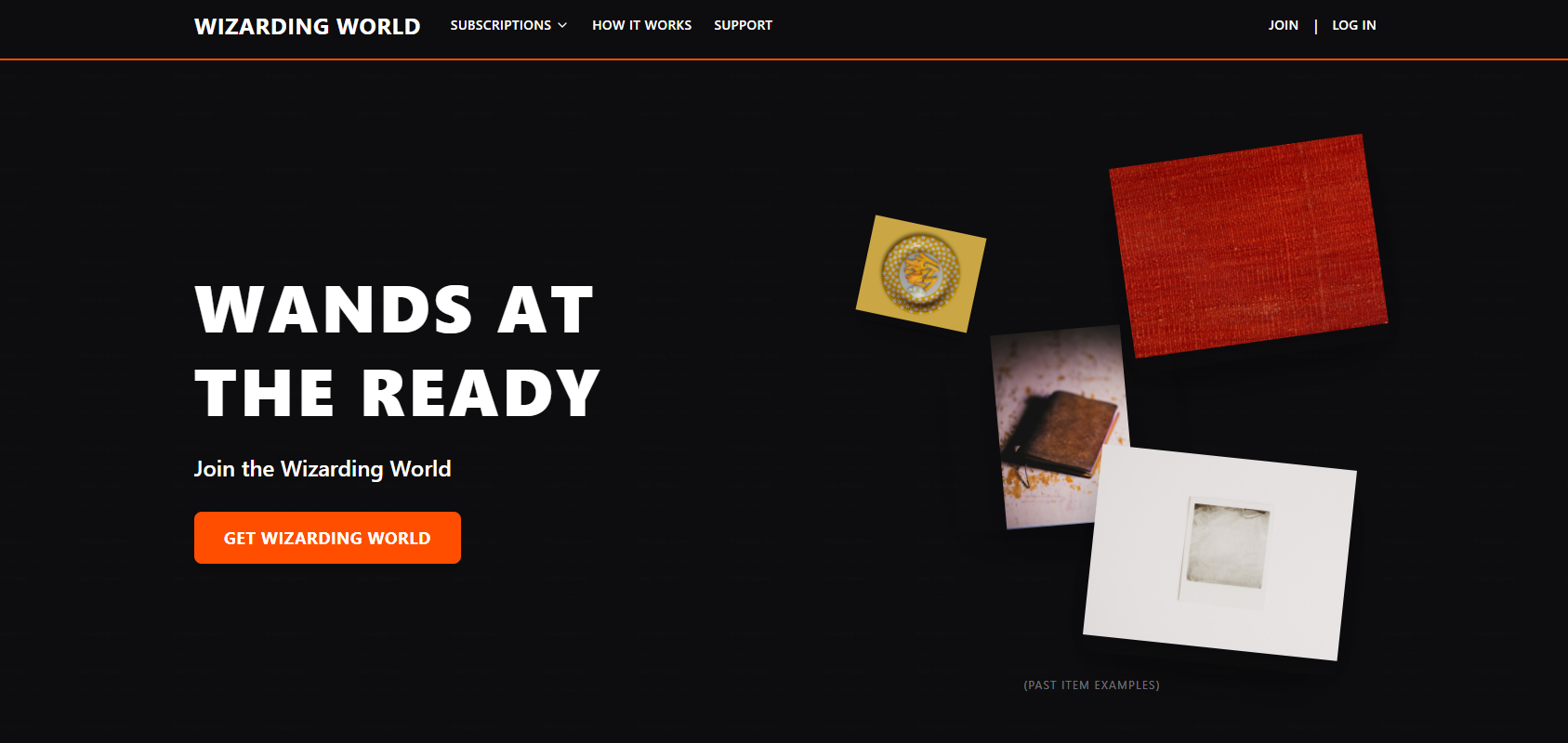
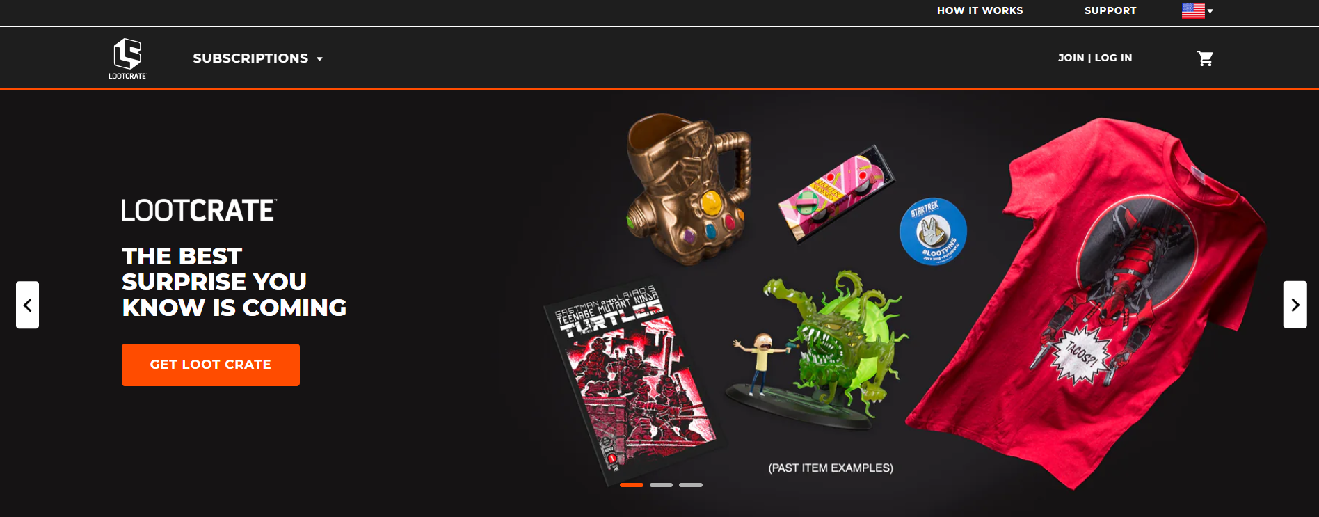
Creating a hero section inspired by Loot Crate
Prompt example:
Recreate a hero section inspired by the attached example. Use a full-width layout with a dark navigation bar at the top containing the logo on the left, a “Subscriptions” dropdown, and “How It Works,” “Support,” and “Join | Log In” links on the right. Below the header, include a large hero banner with a split composition. The left side should have bold uppercase headline text “WANDS AT THE READY” and a subheadline “Join the Wizarding World” with an orange CTA button labeled “Get Wizarding World.” Use black text (#000000) for headings and orange (#FF4E00) for the button, with white text inside the button.
The right side of the hero banner should display themed product images (for example, scarf, pin, notebook, and bag) arranged with slight overlap and subtle shadowing. Use a faint patterned background texture resembling aged parchment or newspaper print to add depth without distracting from the main visuals. Maintain wide margins and centered alignment for balance. The section should be responsive with the text stacking above the imagery on mobile. Use clean typography with strong weight for headings (e.g., Poppins 800) and medium weight for subtext.
Image added to the prompt:
Builder output: